AGLV - Using List View

Introduction

Navigating to most modules in Paragon will bring you to the list view page. The list view neatly arranges your records in a vertical list. Its purpose is to help you easily analyze information by grouping and/or filtering your data based on certain criteria (or attributes) of your choice. Not all records in each list view will always be relevant to you. This document explains how to filter your list views so that they are most efficient for you and your daily tasks. All of your preferences and configurations are saved in each module, to your own user.

Viewing a module

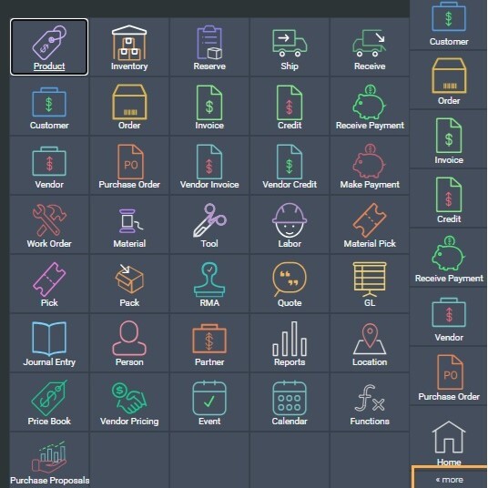
From anywhere in Paragon, click the more button and select the module related to the task you want to work on. When you open any module, by default, you are presented with the list view.
 
 
At any time, you can toggle between list view and detail view by clicking on this button, or by double clicking on any record shown in the list.
 
 
If you are already in the detail view of a module, click the list-detail toggle button located at the top-left of the screen to switch to the list view for that module.
 

Sorting columns

Most list view columns can be sorted by ascending or descending order by clicking on the header of each column. For example, transactions will be sorted with the most recent entries at the top of the list, by default. They can be resorted in reverse sequence by clicking on the transaction ID header. You can sort any list view column in ascending or descending order this way.
 
 
For example, if you would like to see your shipments sorted by the carrier you shipped them with, you can click on the carrier column header to sort it in the order you'd like.
 
 
References work in the same way. In our example, we are using the product module. By clicking on the first header (the product ID column header), you can sort your product items alpha-numerically.
 
 
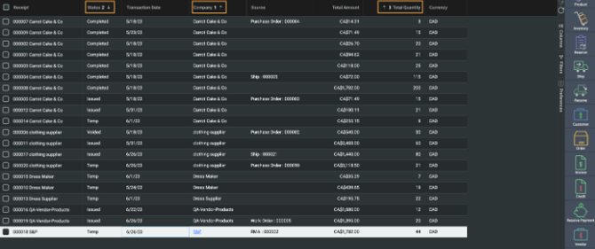
A neat trick is being able to sort by multiple columns simultaneously. After sorting by the first column of your choice, click and hold shift on your keyboard, then click on the second column's header that you want sorted. The headers will be numbered in sequence, indicating the order in which the attributes are sorted.
 

Columns Panel

Filling the list view with many attribute columns can leave you with too much information to process, making it difficult to view the relevant information to be analyzed. To better suit your business needs, the attribute columns that appear in list view can be changed. The first column is fixed, however, the rest can be added, removed, and/or moved to serve you best.
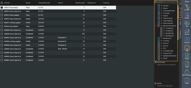
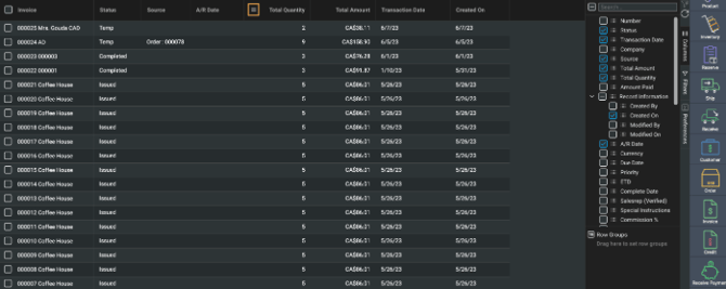
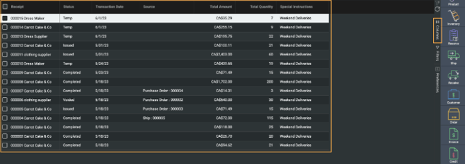
Clicking on the columns hamburger button that appears on the right (aligned vertically), a list of attributes from which you can select appears. At the top of the list is a search bar that allows you to quickly find any attribute from that list.
 

Column attributes available for transactions

The list view for transaction modules offer extra column options for Discounts, Other Charges, In Transit Costs, and Taxes. These can also be selected to show on the list view screens.


Select/unselect columns

You can select or unselect the checkboxes next to each attribute in the columns panel to add or remove them from the list view. The list view will be updated automatically as you select and unselect.
 

Some types of attributes are associated with each other in the panel so you can select/unselect the entire group at once or one attribute at a time.
 

Rearrange columns

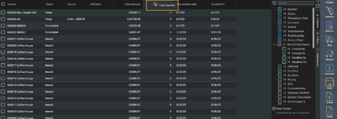
If you hover the cursor over any header in the list view, a small hamburger icon appears, letting you know that you have the ability to move it to rearrange the order in which the columns appear.
 
 
To rearrange a column, click and hold on the hamburger icon and drag it to the position you want.
 

Add by click and drag

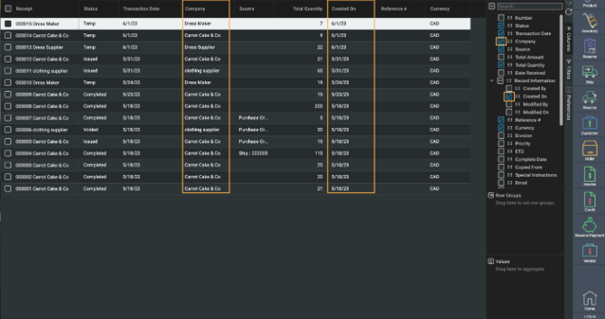
Apart from selecting the checkboxes from the columns panel, you can also click and hold the grid square icon next to any unselected attribute and drag it directly to a specific position in the list view.
 
 
Once you are satisfied with the columns you have selected, you can collapse the column panel by clicking on the columns hamburger button again.
 

Row Grouping

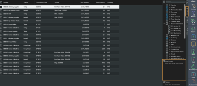
The Row Groups feature is the second section found in the columns tab. It gives you the ability to organize your list view into collapsible groups by column, each containing records that match the selected row group category.  


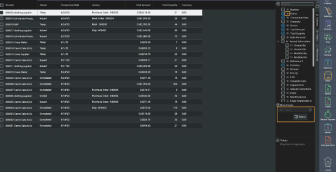
Click and drag the attribute from the columns list just above and drop them into the row groups section to group the list view by that attribute.
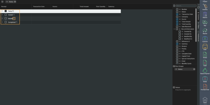
For example, if you would like to view your transactions grouped by status, click and drag the status attribute and drop it into the row groups section.


Your list view will then be organized into collapsible rows, organized by transaction status. A count for the number of rows in each group is provided next to each row.  
 
 
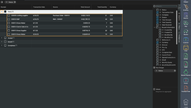
Clicking on the arrow next to each row expands the group, showing you a list of all the records that fall under that group.
 
 
To quickly group your list view, hover your cursor over the attribute header you wish to group by. Doing so will make a small menu icon appear. Click on it and select the group by option from the dropdown.
 
 
Once done, your list view will be grouped by that attribute.
 

Multi-grouping

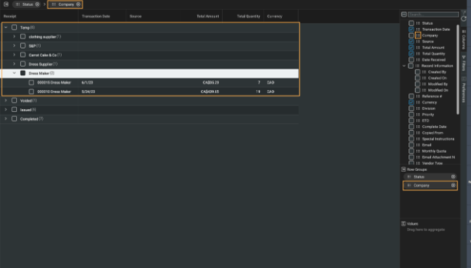
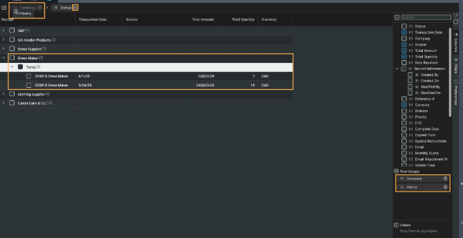
If any column is grouped, a row group header will appear at the very top of the list view - above the columns. This header shows the attributes that are currently being grouped. You can also drag and drop more attributes from the columns panel on the right, straight into this header. This allows you to quickly add or remove groups while deciding in which order to group the columns.
 
 
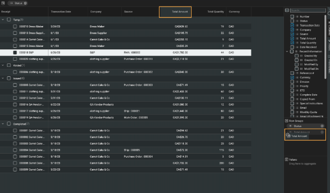
Inversely, you can also drag and drop attributes from the column headers in the list view straight into the row groups section in the columns tab, instead of having to search through the list of attributes.
 
 
Click and drag the attributes to rearrange the order in which the rows are grouped. You can also remove an attribute from the grouping by clicking on the delete button next to the attribute in the row group header.
Continuing with our example from above, we can now see that the list view is grouped by company and then status.


Selecting entire groups

Selecting entire groups and rows at once allows you to efficiently select multiple records for other tasks, such as bulk actions.
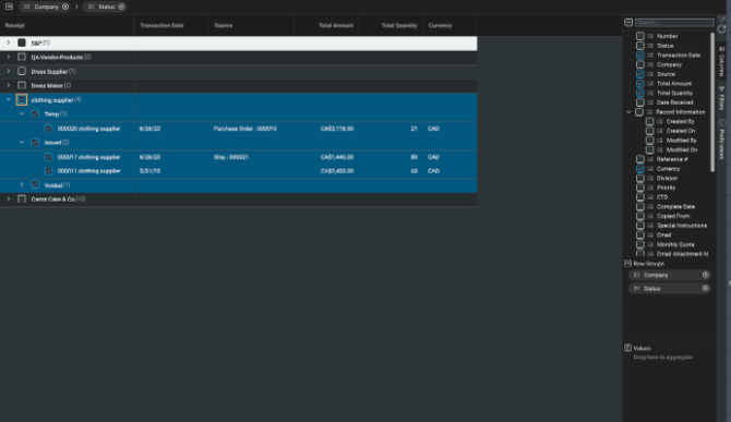
Clicking on a row group header's checkbox in the list view will select all of the records that are grouped within it.
 
 
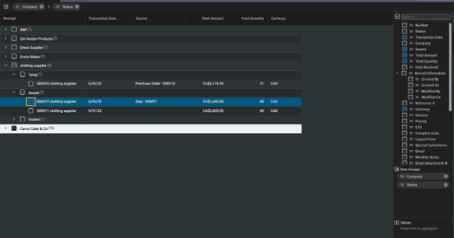
Alternatively, you can always select an individual record (even f grouped) by clicking on its corresponding checkbox.


Values and Aggregates

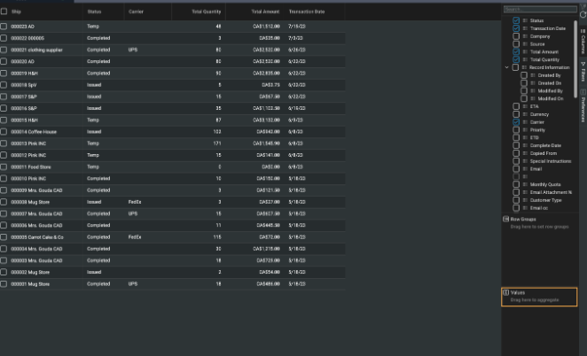
The third feature available from the columns tab is the values section - found just below the row groups. This feature gives you quick calculations of the records you see in the list view. Its ease of use can allow you to do some quick analysis from within a module, making it a powerful everyday tool.
 
 
To use the aggregates feature, you will first need to configure your list view with row groups. After deciding on which attribute you would like to group by, you can then select an attribute value to aggregate (or run a calculation on). Depending on the attribute, you will be able to aggregate it in a variety of ways.
- Date attributes can have minimum and maximum values.
- Calculated attributes have minimum and maximum, but can also be summed and averaged.
- Free flow attributes have minimum, maximum, first, last, count, unique, and all options.
 
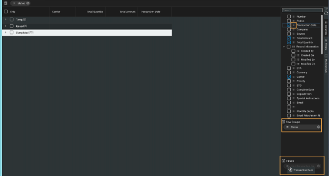
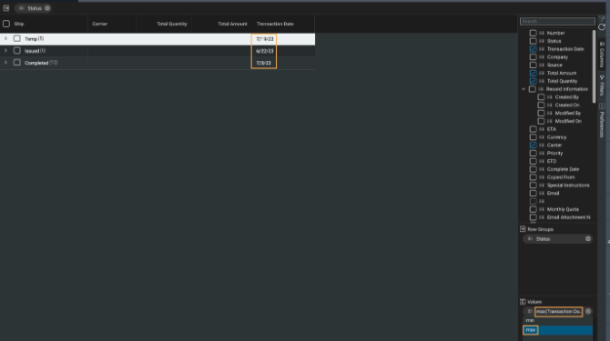
For example, if you want your list view to be organized by status, but also wanted to be able to quickly see what the earliest transaction date is for each status group, you could do so using row groups and aggregates simultaneously.
First, you will need to add the status attribute to row groups, then add transaction date to the values section just underneath. As with row groups, you can do so by clicking and dragging the attribute from the list in the columns panel.
 
 
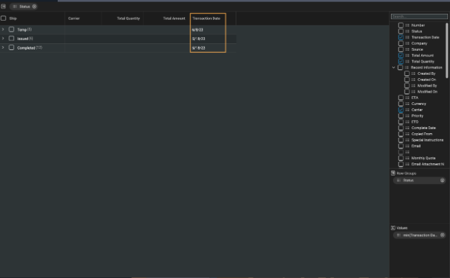
You will see the transaction date column filled with dates. In this example, we are viewing the earliest transaction date within each status group.
 
 
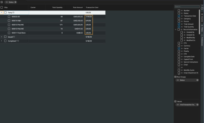
If you expand any of the row groups, you will still be able to view each record's specific transaction date.
 
 
Since this is a date attribute, the only other way you can aggregate the value is by its max value, which in this case would be the latest transaction date for each row group. You can do so by clicking on the attribute name in the bottom right corner and selecting max. Doing so will instantaneously update your list view.
 
 
As with row groups, you can remove an attribute from the values section by clicking on the x next to the attribute.
 

Filtering

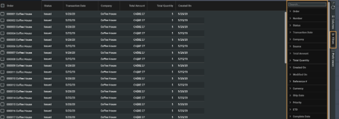
Once you have set up your list view columns to show the data you want to see in that module, you can refine your list view even further. For example, you may want to only view transactions that occurred on a specific date or products that are being sold at a certain price point. You can do so by using the filter function. Click on the filters tab that appears to the right of the list (aligned vertically), to open the filtering panel. Here you can see the list of attributes by which you can filter the list.
 
 
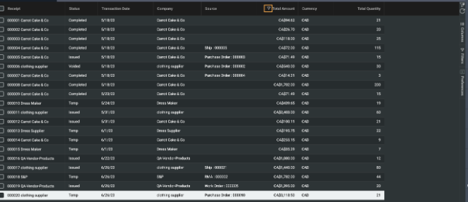
If a column is filtered, a small filter icon will appear at the right of the column heading.
 

Filtering options vary depending on the type of attribute selected.


Filtering by Dates
Filtering on a date attribute will open a date picker.
 
 
Once you select a date, click on the apply button to see the change applied to the list view. You will also see a small filter icon next to the column header, confirming that a filter has been applied.
 
 
There are a variety of methods to filter by date attributes. Clicking on the dropdown menu will present you with a list of options.
- Equals (the default option)
- Greater than
- Less than
- Not equal
- In range (between two selected dates)
 
 
You can apply up to two conditions to your filter by using the add/or feature. Select your first condition and corresponding date (in this example we selected not equal to June 7th), choose the appropriate and/or option (here we selected AND), select your second condition and date (we chose greater than June 1st), and finally click the apply button.
 
 
At any point, click the reset button to clear any filter(s) applied to the selected attribute.
 

List and checkboxes

Filtering a list-type attribute will provide a list of all values in that list along with checkboxes to select from. Click the apply button to see the filter applied to the list view.
 
 
Use the search bar on the top of the checklist to quickly find what you're looking for. The search (referred to as a type-ahead search) shows you possible results as you type, which will make finding your choice easier and faster.
 
 
Similar to the columns panel, you can select or unselect all values in the results list by clicking on the first checkbox labeled select all. Doing so will select or unselect the currently shown results, rather than all the values for that attribute. Click apply to see your changes in the list view.


Filtering on Numbers

Filtering on a number attribute only allows you to enter a number value to filter by. Once you enter the value you want, click on apply and see the filter applied to the list view.
 
 
There are a variety of methods to filter by number attributes. Clicking on the dropdown menu will present you with a list of options.
- Equals (the default option)
- Not equal
- Less than
- Less than or equals
- Greater than
- Greater than or equals
- In range (falls between two values)
 
 
You can apply up to two conditions to your filter by using the add/or feature. Select your first condition and corresponding value (in this example we selected equals and 150), choose the appropriate and/or option (here we selected OR), select your second condition and value (we chose equals and 100), and finally click the apply button.
 

Filtering on Text

Filtering on a text attribute presents you with a text box to fill.
 
 
Once you enter the text you want to filter for, click on apply to see the changes take effect in the list view. A small filter icon will also appear on the header of the attribute you are filtering.
 
 
There are a variety of methods to filter by text attributes. Clicking on the dropdown menu will present you with a list of options.
 
 
- Contains
- Not contains
- Equals
- Not equal
- Starts with
- Ends with
 
You can apply up to two conditions to your filter by using the add/or feature. Select your first condition and corresponding value (in this example we selected contains and coff), choose the appropriate and/or option (here we selected OR), select your second condition and value (we chose contains and bike), and finally click the apply button.


Quick filters

For even faster filtering, you can select and apply your filters without opening the filter panel. Hover the mouse over any column header in the list view and a small hamburger icon will appear.
 
 
Click on it, then click on the filter icon to gain quick access to the filtering options for that attribute. Following the steps on how to use filtering, explained above, will provide you with the same filtering capabilities at your fingertips.


A small filter icon will appear in the header of that attribute, giving you a quick visual indicator if you have a filter applied on any column.
 
 
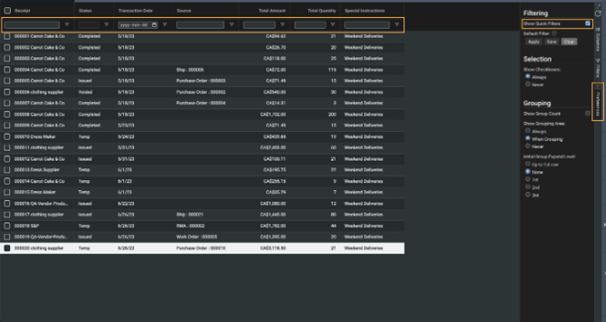
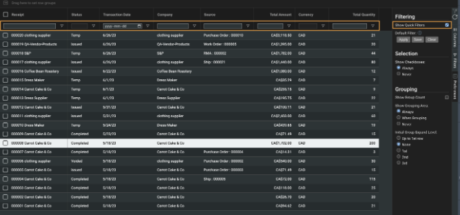
Another quick way to access filters is by clicking on the show quick filters checkbox in the preferences tab. Doing so will open up a row of quick filtering options below each header, giving you quick access to the same filtering options.
 

Special characters

Certain special characters, such as the percent symbol (%), underscore (_) and the backslash (\) are handled differently when filtering. To apply a filter with one of these special characters, you will need to precede the special character with a backslash (\). Here is an example to better explain how to use this functionality.
We are trying to filter our list view with products that include the description Sweater\Jumper. Therefore, we will type sweater\\jumper in the filter field for the attribute description.
 
 
If we were to type it without the additional backslash (\), the filter would return no results.
 
This kind of filter functionality can be particularly useful when handling records with information such as serial numbers and SKUs, which tend to contain special characters.


Note: a forward slash (/) is not considered a special character, therefore it would not need to be handled differently from letters and numbers.


Preferences
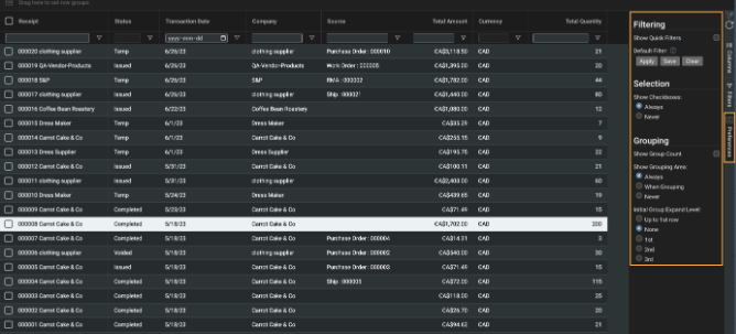
The last collapsible side tab you can see is the preferences tab. Clicking on it will open a list of settings for you to choose from that allow you to customize your view of filters, selections and grouping.
 
Filtering

Show quick filters

The first section of the tab focuses on your view of filters. The show quick filters checkbox allows you to control the row of filter buttons beneath each attribute header, giving you access to quick filters. Selecting and unselecting the checkbox will instantaneously make the quick filters row appear and disappear.


Default filter

If there is a specific filter setup that you find yourself consistently switching to on any of the transaction or reference modules, you may want a quick and easy way to apply the filter(s). Paragon gives you this ability with a this quick and handy tool within the preferences tab. It is saved to your log in credentials only.
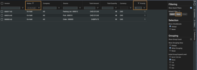
Firstly, set up your filter(s) the way you would like. Once done, click on the save button from the default filter section. This will then save your selection as a default filter to the module you are on for later use. In this example, we have filters applied to transactions with priority 1 and a status of On Hold.
 
 
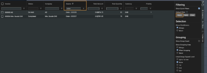
If you then edit your list view with other filters and need to quickly jump back to your default saved filters, you can do so with this handy tool by clicking on apply.
 
 
After clicking on apply, all filters will be cleared and your previously saved default filters will be applied again.


Note that clicking on the clear filters button will now default to this saved default filter, rather than clearing all filters.
If you want to save a new set of filters as your default filter, you can just follow the same steps again. You can only have one set of default filters set.
 
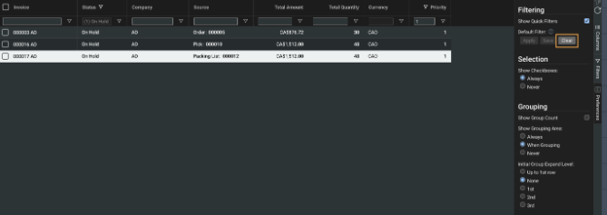
If you want to clear your selected default filter, you can do so by clicking on the clear button.
 
 
Selection
This section of the preferences tab allows you to show or hide the checkboxes to the left of each row. Clicking on always will make all checkboxes appear, while clicking on never will hide the checkboxes.
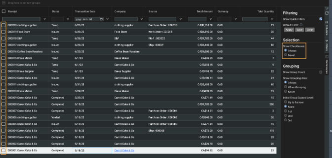


Note that without the checkboxes, you will not be able to select the records you want to use with bulk actions.
 
Grouping

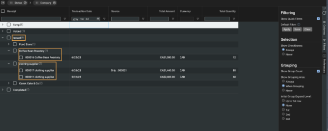
Show Group Count

This checkbox will allow you to quickly view the number of records in that specific row group. For example, if you are grouping by status and company, the count can show you how many rows are issued, and how many of them belong to each company.


Show Grouping Area

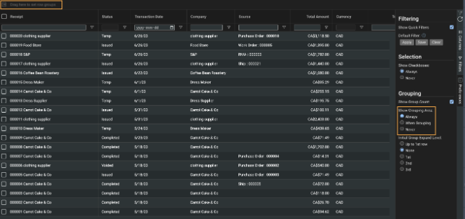
This section allows you to select when you want the grouping area above the list view headers to be visible. Selecting the when grouping option will make the row group header only visible when using the grouping function.
 
 
Initial Group Expand Level
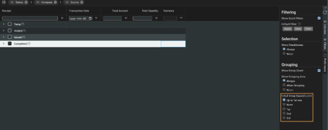
When viewing the list view with multiple row groups set, it may begin to look cluttered after having worked in a module for some time. To help give you a more organized view of list view every time you log in to Paragon, you may want to make use of Initial Group Expand Level.


The changes to your selection are not immediate. The only take effect after your log out and back in to Paragon. Therefore if you are switching between modules for your workflow, your current list view will not change.


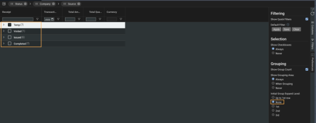
If you have it set to none, then all of the row groups will be collapsed when you navigate to the module.
 
 
If you have it set to up to 1st row, then only all of the rows within the first row will be expanded.
 
 
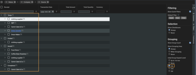
If you have it set to 1st, then all of the first attribute row groups will be expanded, with other row groups collapsed.
 
 
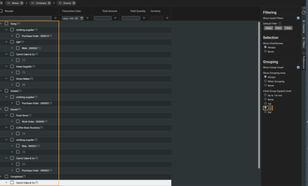
If you have it set to 2nd, then all of the first and second attribute row groups will be expanded, with following row groups collapsed.
 
 
Layout
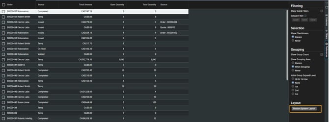
If you have been adding a lot of attributes to your list view columns, you may eventually find it too messy to read. Paragon has a handy tool that allows you to reset your list view columns layout. By using the restore default layout button in the preferences tab, your selected attributes will be cleared, leaving only a few important attributes.
 
 
Clicking the button will not clear your filters or sorting that you had already set.
 

Select Layout

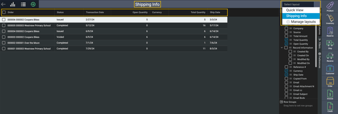
On the top right of the list view is a Select Layout feature which allows you to create and manage any configurations you want to save. These might be layouts you use frequently but need to quickly and easily switch between them to be efficient.
 
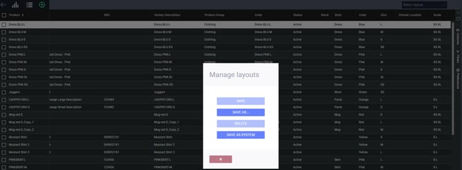
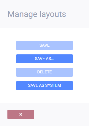
To create your first saved layout, once your list view is configured to your needs, click Select Layout followed by Manage Layouts.
A modal will appear. Since this is your first layout, only the option to save layout as will be available. Click it to save your current list view layout.
 
 
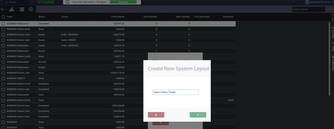
The create new layout modal will open. Enter a name for your new layout and click the accept button
 
You will now see the layout name you entered in the previous modal as the heading of your list view.
You can create multiple layouts at any time and easily switch between them by selecting a previously saved layout name in the select layout list.
 
To edit an existing layout, select it from the list, change the attributes and configuration to your liking, and click the save layout button. This will overwrite the saved layout you have selected.
 
To delete a layout, select it from the list, then click the delete layout button.

Clear and refresh

On the top right of the list view, just above the columns tab, are the refresh and clear buttons.
Clicking the refresh button will update the list view and make sure that the data is current. If there are multiple people using Paragon simultaneously, the refresh button will update the list view with any newly created or edited records in the module.  
 
 
Clicking the clear button will reset your list view to the default filter. 


Bulk actions

In an effort to avoid tedious repetition, Paragon gives you the ability to perform the same action to selected rows with the bulk actions function.
Selecting rows by clicking on their respective checkboxes, or by clicking on their row groups will make the bulk actions button appear in the top right corner.
 
 
Click on bulk actions and a small menu of options will appear, presenting you with actions applicable for that module. In this example, we will be issuing the selected Invoices.
 
 
Before the bulk action is run, a modal will appear asking you to confirm your choice. To confirm it, select the checkbox and then click on the accept button. If you don't want to perform the bulk action, change the action selected or change the records you selected, click on the cancel button to go back.
 
 
After the bulk action is run, a small modal will appear giving you a summary of the records that were run successfully and/or unsuccessfully. If any records were run unsuccessfully, the modal will also provide a brief description as to why Paragon was not able to.
 
 
To streamline your workflow, the bulk action feature can also be used in tandem with row groups and filtering, allowing you to select a large selection of records based on the grouping or filtering you have already applied.
 
An example would be completing an entire row group of issued Invoices for a specific customer.
 
 
Another example would be printing all invoices that were due earlier than a certain set date, by using filters.
 

Tips & Tricks

Paragon allows you to quickly organize your list view with a few handy tools, giving you an easier way to customize and read your list view. As with other list view settings and tools, these are saved per use and per module.
Pinning
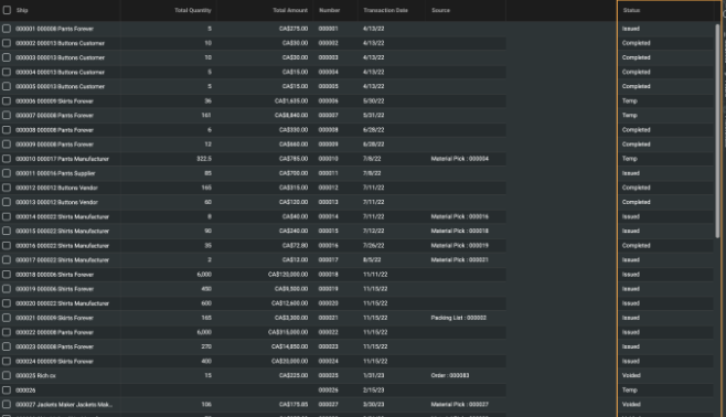
If you hover your cursor over an attribute header, a small menu icon will appear. Click on it and select pin column. From there, you can select if you want to pin the attribute to the right or left side of the module's list view. You can also un-pin the attribute by selecting no pin.
 
 
In this example, we have pinned the status attribute to the right.
 
Autosizing Columns
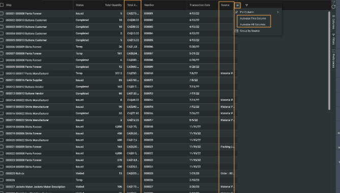
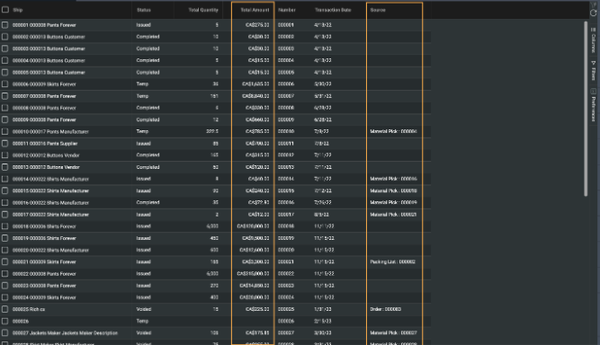
Not all columns contain a lot of information, however when adding new ones to your list view, the column size might be too small to read all the information for a record. Hovering on any attribute header will display a small menu icon. From there, you can select to autosize the selected attribute's column, or even all of the columns in your list view. This will also reduce the size of a column as well, if that is what is necessary. 
 
 
In this example, we clicked on autosize all columns, which has made the attributes Total Amount and Source easier to read. It has also reduced the column size of the attribute Number, reducing unnecessary space in this module's list view.


Light or dark mode

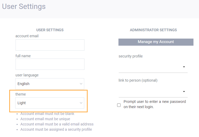
All of the screens shown above are using the dark mode option for viewing the list view screens. There is also a light mode that can be set up in the user settings modal. Ask your system administrator to change this setting to light if that is your preference.